One Credit Review: Martial Champion, 1993 Konami
Reviewing old arcade games using only one credit.
Every major Japanese development company has established their own major fighting franchise over the years, sometimes more than one if they lean into the fighting genre. Sega has Virtua Fighter, Capcom has Street Fighter, Namco has Tekken. Nintendo has Hogan's Alley. There is one major player missing though, Konami. I thought I must be mistaken, surely they had one hit fighting game back in the day. Didn't they do like, Fighting Vipers? Oh, that's Sega. Maybe Battle Arena Toshinden! Takara? Okay. Oh! That game Bloody Roar! Well, apparently Konami published Bloody Roar 4 for PS2, just after they bought out Hudson Soft, and long after the novelty of zoanthropy wore off. Konami has never said the words ‘Bloody’ and ‘Roar’ in conjunction ever since. Wait, I just remembered Vs! Dammit, THQ.
I took a look at a list of Konami games, and oh man, is TMNT Tournament Fighters really their most popular fighting game to date? It's either that, or Yie Ar Kung Fu. The only other fighters seem to be me-too type games. Some 2D fighters in the early 90s after the rise of Street Fighter II, then as 3D fighters like Tekken and Virtua Fighter took off, then came Konami's 3D fighters as well. Most games stayed in Japan, but a few like Deadly Arts for N64 and Kensei: Sacred Fist for PSX, both made their way to North America in '98
That quick history brings us to Konami’s first attempt at a Street Fighter II clone, Martial Champion!
This game is bad. Like, Street Fighter 1 bad. Even when this game came out it couldn't have gotten good reviews. Street Fighter II already existed and was seriously good. Clones like this one came fast, but without the passion and time the SFII developers got, nothing was going to come close. Some devs did get the kind of dedication needed to create a genre defining games, and there grew the niche greatness of SNK. On US soil, that led to Mortal Kombat (and the whole other fighting game subsection of Mortal Kombat clones).
Konami didn't take their time though, and it shows. The only thing I can give Martial Champion credit for is the very large sprites in their game. Unfortunately, it's not really praise when the sprites are drawn so haphazardly. Some of these characters don’t even look like they belong in the same game. In fact, the sprites are actually too large, large portions of your character are often off screen. It looks like the developers of Guilty Gear / BlazBlue had to make a fighting game with the original Final Fight arcade engine.
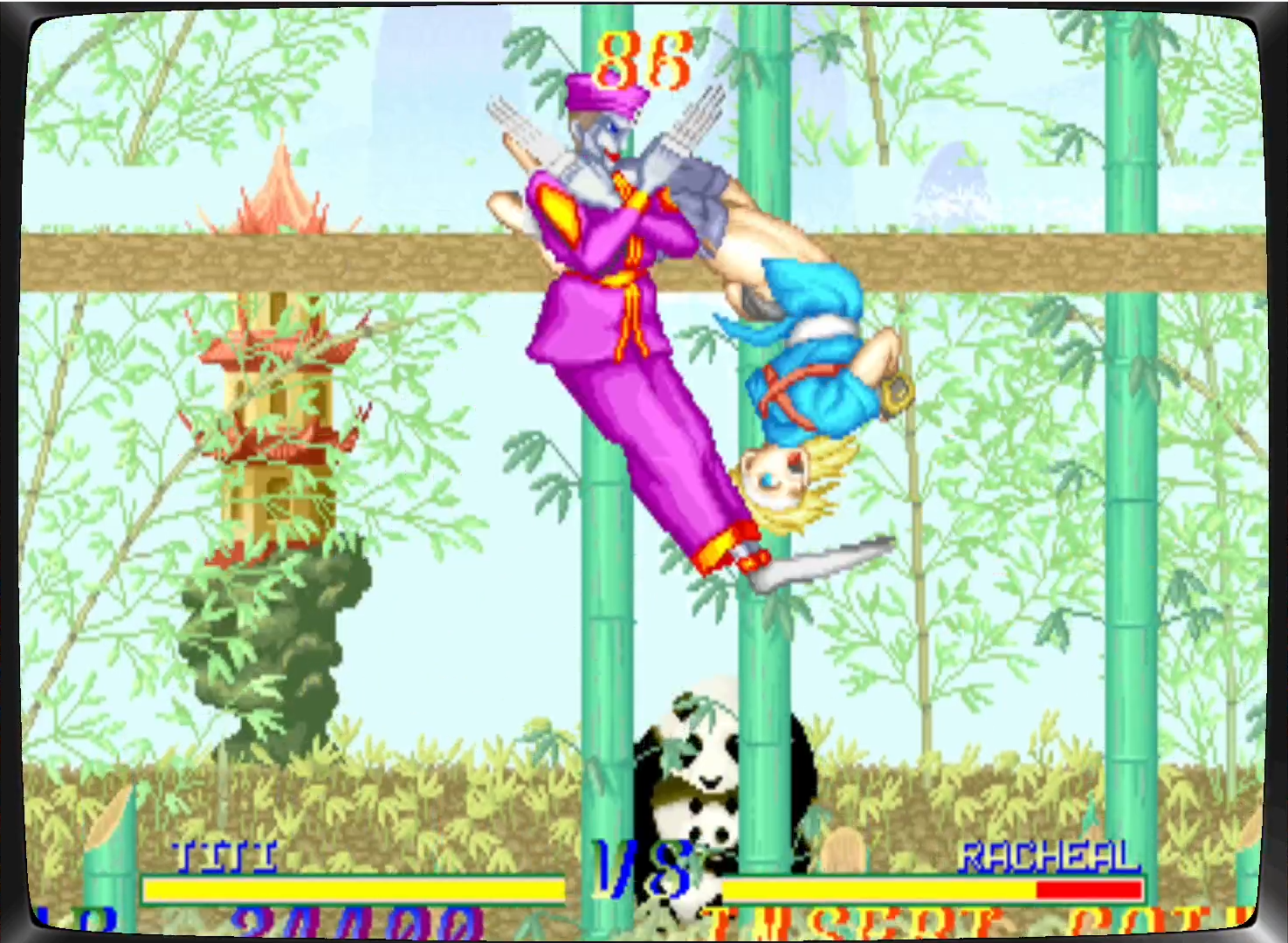
I decided to use this Vega ripoff named Titi. No reason. I chose this character over Bobby or 'Racheal'. All of these characters appear to be from different countries, just like that other really popular fighting game that everyone already loves and enjoys. But maybe your new favorite character won’t be Ken or Ryu, it will be Goldor!
Looks like he is trying to escape out of this game. I don't blame him. But I don't want him here either.
Playing a game like Martial Champion really makes me appreciate what quality fighters got right so early on in this genre. Simple, obvious things like fluidity of movement, and body positioning. In Street Figher 2, you can see what a kick or a punch is, and can easily get a grasp on the time and reach of a move. A punch is probably going to reach to the end of your fist. When you duck, and then hit kick, you will probably do a low kick. Clearly these good fighting games lack the element of surprise. Characters in Martial Champion just seem to flail around, doing all kinds of ‘maneuvers’ in order to do a standard attack. It's disorienting, and mixed with the primary color character design and cartoony facial animations, it all comes together into a somewhat fascinating level of early 90s ugly. Not just ugly, but an aesthetic of ugly that is specific to a certain time. You think pixel art is beautiful? You're gonna want to slap some filters on this one.
Considering all this ugliness, I was ready to call it a lazy cash in after the first match. Since I only made it to the second fight before I lost my credit, I only saw three of the ten fighters in action, my character, Titi, went up against the formidable foes of Hoi from China, and Racheal from the USA. My character is very bland, almost no facial animation at all, attacks as if he has no knees or elbows, and is covered in one shade of purple head to toe, which makes his movement look even more jumbled and inhuman. Hoi didn't seem much better, his loose fitting fighting attire looks more like puffy dance clothes, and he's also got the same yellow and purple my character has, making things even more jumbled and messy whenever we engage in close combat, which is often in a fighting game.
Then I got to the next battle, and I realized the developers did care about animation, and anatomy, and movement. At least whoever got the job of drawing and animating 'Racheal.' They can't spell her name right, but damn can they make sure she can put on her best chun-li impression (well, could argue Cammy, but doubtful since the character debuted the same year Martial Champion launched.)
I can’t quite put a finger on it, but for some reason, she seems a bit more lively than the other characters I’ve seen.
Got caught peepin' that's why you lost.
Then I died, game over. And that's when the most unforgiveable issue of all crops up. I like to use two initials when I enter a high score. “AR”
Oh shit, that is why I lost.
To enter a high score, most games will give you the full alphabet, of course, then maybe a blank space, or even some punctuation like a period or exclamation mark. The best high score tables even go hard with more random symbols than you could even look through in the 30 seconds or less that you get to enter your score. This game though, doesn't even give you a blank space. Just A-Z and not a single thing more. Not even empty space.
ARR!
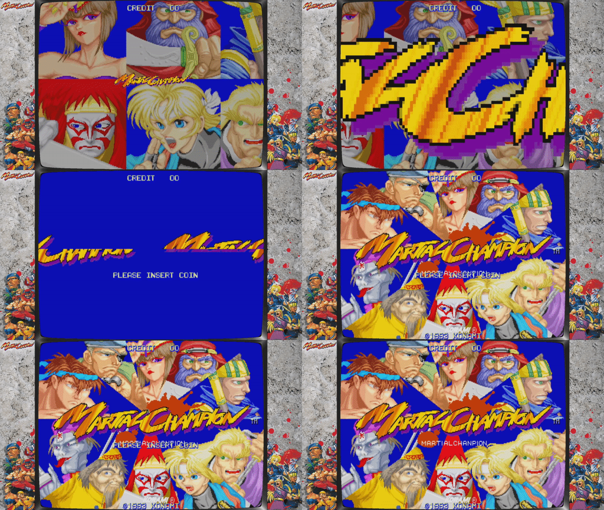
If you somehow run across Martial Champion in the wild, I do not recommend you spend a quarter on it. There were some graphical issues on the MAME version of the game, but they didn’t seem to affect anything during gameplay. It just affected the only joy I got out of this game, which was the bad ass attract mode intro with that hard hitting guitar riff. Gets me so pumped to play Street Fighter 2 or above.
I'm really upset that this is where the graphic issue is most noticeable. I really need this image as my desktop wallpaper. Please send help.


