Clayfighter 63 1/3 for Nintendo 64 box art review
This article was released two weeks early for Patreon subscribers. Get early and exclusive articles by becoming a Patron!
Oh boxed N64 collectors, don't you just love to see this spine on the shelf?
For some reason, Clayfighter was always trying to call out Mortal Kombat and Street Fighter in their advertising. I'm actually surprised, and I'm sure it was discussed, and it would have probably looked a lot better, if they just straight up ripped off the box art from Mortal Kombat as well. I know they picked on Street Fighter a tad, but they were really up in Mortal Kombat's ass with all the 'parody' ads. I learned this thanks to Reyan Ali aka nbajambook on twitter, who already did the work for me by showing some side by side comparisons of ads from both Mortal Kombat and Clayfighter.
It turns out that this is even more over the top than I remember. Even the original Clayfighter magazine ads were attempting to mock classics of the day, which were still Street Fighter and Mortal Kombat, which were at the peak of their popularity at this point. Which is what gave Clayfighters the chance to attempt to get a piece of that pie. Clayfighter 63 1/3 is the sequel to that cash in, because if you are going to cash in once, you aren't above trying to cash in twice. Or even more times, since this is the fourth iteration of this series.
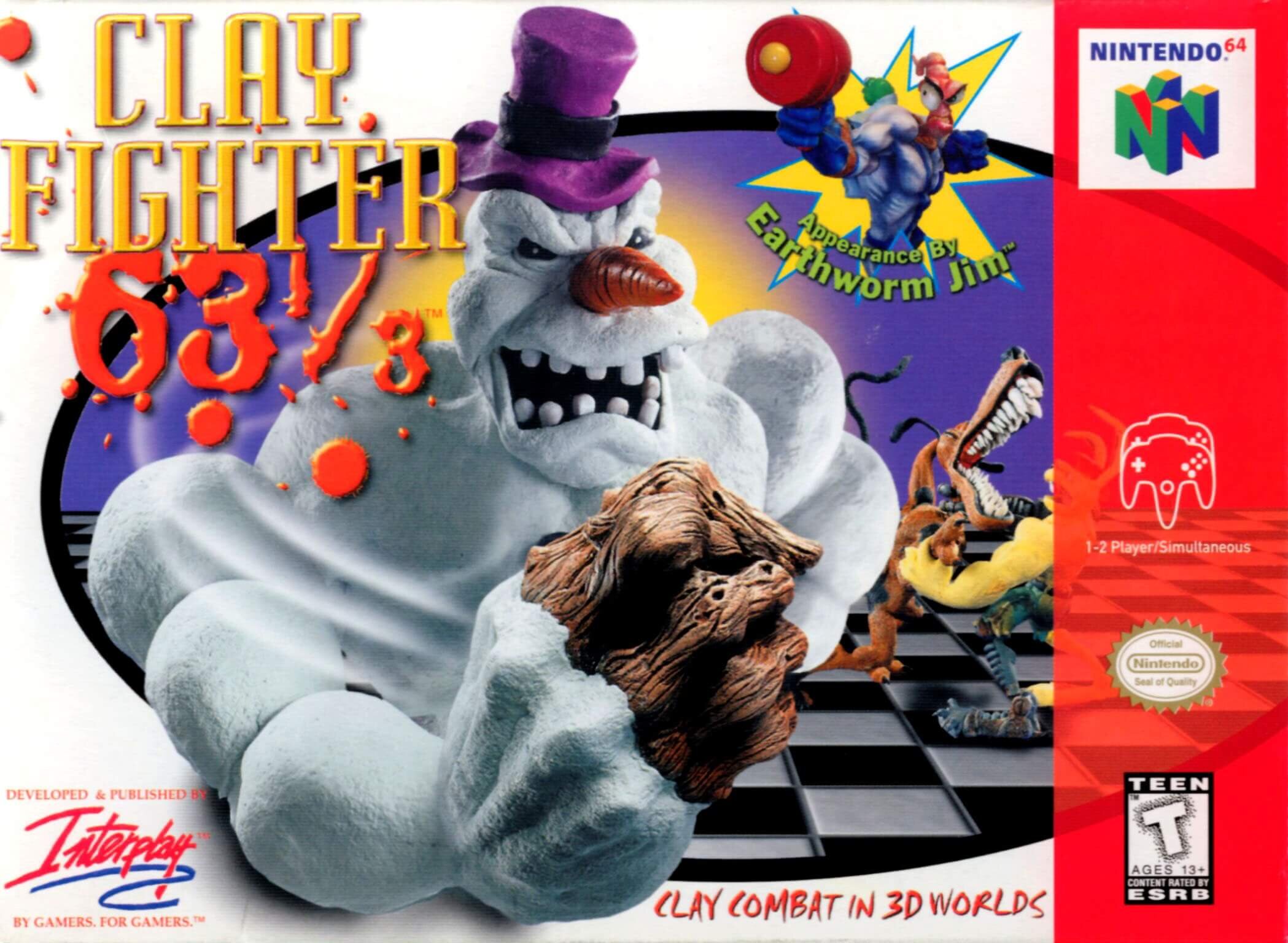
Let's start from the front. These box art write ups get me all worked up apparently. I begrudingly have to start with the title. It looks mad generic. You would think that a sequel, which features the only prominent character your company has, would draw up an original logo. Nah, use that same font they used in Fighting Spirit or Fighter's Rift or whatever it was called. Apparently I was mixing up the well known “Fighter's Destiny” and “Dark Rift” but what I really meant was “Flying Dragon.”
Nintendo forcing developers to go 3D really killed momentum for the fighting genre on Nintendo consoles. Even on playstation and in the arcades, by 1997 fighting games in general had lost some of their luster. Though a decent idea for a cash grab initially. This idea is well past the expiration date for seeing decent returns. The only chance a middling game like this has is to launch on the N64, where owners were desperate to buy anything for a reasonable price. I'm actually surprised this didn't get the "Only for" N64 tag up in the top right. I guess they were still planning that PSX release when this ugly box landed on store shelves.
Then there is the 63 1/3. Thankfully, besides the Director's Cut of this game, Nobody else made this, I won't call it a joke, this, light observation, for the rest of the run of the N64. They use a different font for the numbers, which makes it just a smidge less generic, but what do the splatters represent? Blood? Red clay?
Note the subtle swoosh effect that gives Bad Mr. Frosty's fist a sense of motion. "Woosh!" the fist says. I don't understand why they made an angry Frosty the snowman the main mascot for this series. You'd think they would have used almost anything more clay-centric idea, but no, they had a snowman. The only rational I have is that the initial versions of the SNES and N64 Clayfighter games were released near Christmas. Not in December though, and the other three Clayfighter games all had releases in spring. So that theory is out the window.
So I guess it's my other theory. Someone working at Interplay made a clay model of angry frosty, for no real reason. Then someone said, "Yes, digitize that masterpiece! what else can you make out of clay? Can you make them do fatalities like in that mortal combat?"
An appearance by Earthworm Jim! In the year of our lord 1997! Earthworm Jim 2 had come out in 1995, so he was still pretty fresh in gamer's memories. Not to mention all the merchandising deals Earthworm Jim got alongside the cartoon show. It's hard to imagine now, but even though the Earthworm Jim games weren't stellar by any means. They had a weirdness, combined with a great animation style that really did feel like an indie comic book or adult oriented cartoon. It had charm, which is far more than what most of the me too mascot platformers had back in the 16-bit era. Basically, in 1997, when people were still hoping that Earthworm Jim could make the jump to 3D, the non-standard hero was a strong endorsement. There is also Boogerman, from Boogerman. He is not a strong endorsement.
Somehow, the annoying marketing gimmick of references to Mortal Kombat and Street Fighter ended up not so subtly making it's way onto the box itself. Right there in a bright red warning. It's one thing to be a shameless gimmick, but when it's a gimmick that can't stop referencing the competition in an attempt to prop itself up as some edgy alternative, it brings an extra level of shallowness to the game.
"Hey, kid, remember those cool fighting games you play at the arcade? That's kid shit. Come on, I got the real stuff right here. No lame 'realistic violence' here, just uncut OG cartoon violence. Don't walk away. There might be a fart joke in here, come on!"
I was thinking of updating their marketing gimmick for this era of fighting games, you know, “there are no bros in this brawl” etc. But then I realized that Mortal Kombat and Street Fighter are still basically the top of the heap when it comes to fighting games. Especially in the name recognition department. I mean, shit, I saw two separate Mortal Kombat movies this year. And Street Fighter movies, those happened too.
Where is my Clayfighter movie actually? Or at least the very cheap animated cartoon series tie in. Earthworm Jim got a cartoon, and it was decent. Not sure how interplay bungled the merchandising rights for Clayfighters, as well as, ugh, Boogerman. Both characters appear in this game, so it was Smash Bros on the N64 before Smash Bros on the N64, except I don't think anyone on the playground was arguing over who could win in a fight, Earthworm Jim or an evil Frosty the Snowman.
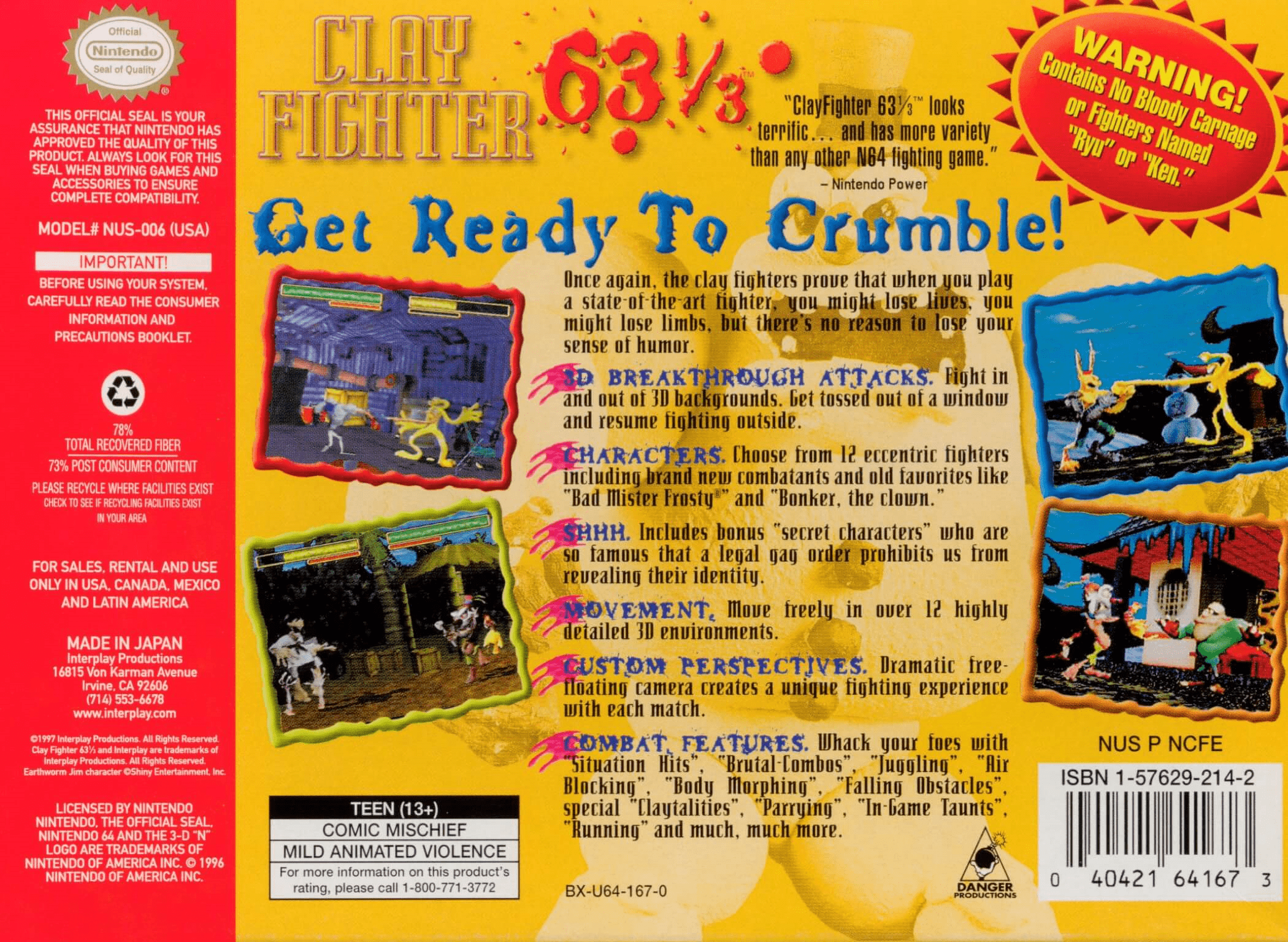
Did an AI algorythm come up with these “Combat Features?” How excited are you about
Robot voice: "Situation Hits, Juggling, Falling Obstacles-"
My voice: "And!"
Robot voice: “Running” (Yes, soon all humans will be running)
Me: "What?"
Robot voice: "Nothing… Human."
I can't say I am all that enthused to be writing about Clayfighter. Just looking at the box art gives me more questions than answers. I could search for answers, but not for this game. It's not worth it. I hope I don't revisit this one in the future, but it is a gold mine of mid-90s corporate decision making.


